
Design System
Our team created a design system that upheld brand integrity while better serving our users and fitting our application. The system enhanced accessibility and ensured our team had the design patterns and critical components we needed.
Design System
Our team created a design system that upheld brand integrity while better serving our users and fitting our application. The system enhanced accessibility and ensured our team had the design patterns and critical components we needed.
Design System
Our team created a design system that upheld brand integrity while better serving our users and fitting our application. The system enhanced accessibility and ensured our team had the design patterns and critical components we needed.
Project
Web application
2021-2022
My Role
UI component design
Interaction design
Prototypes
Tools
Figma
Confluence
Project
Web application
2021-2022
My Role
UI component design
Interaction design
Prototypes
Tools
Figma
Confluence
Project
Web application
2021-2022
My Role
UI component design
Interaction design
Prototypes
Tools
Figma
Confluence
Problems
Different platform
The parent company’s design system was optimized for consumer-focused mobile apps while our users were professionals using a web application, usually on desktops.
Our user demographics
Our demographic skewed older and we had concerns about type legibility and general accessibility.
Control + Customization
Using another team’s UI components left us vulnerable to changes implemented to serve their processes and development timeline.
Opportunity
We could make a more accessible, focused, and scalable design system that kept our team in the driver’s seat.
Opportunity
We could make a more accessible, focused, and scalable design system that kept our team in the driver’s seat.
Opportunity
We could make a more accessible, focused, and scalable design system that kept our team in the driver’s seat.
Goals
Designed for the job
The new design system would be scaled for desktop reading distances, speed data entry and handle complex workflows with ease.
User-centric
Our larger, streamlined type system would reduce eye strain while higher contrast interaction states kept users clear and focused on their work.
Team control
Our UI component library would be scalable, efficient, and easy to maintain.
Design Process
We reviewed the existing design language and researched UI control best practices. We poured over NNGroup research and studied UIKit, Material Design, and the native framework controls.
We used our streamlined color system to ensure color pairing patterns always met or exceeded WCAG AA standards. We created rules for our brand color, two primary type grays, semantic colors, and a set for charts and graphs. We tested and applied spacing standards using our grid to ensure touch target spacing and legibility across touch devices, laptops, and desktops.
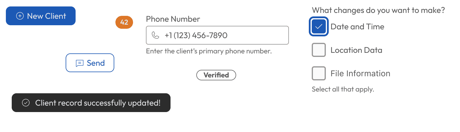
With these guidelines and rules in place, we applied them to all standard web controls and a few hybrid and custom elements like toggles, cards, and sheets. Each element had clear default, selected, hover, focus, error, and disabled states as appropriate.
Our team applied research about accessibility to error states, placing errors inline between the label and input for improved screen reader support and stronger visual callout. This also allowed us to provide helper text below inputs without conflicting with specific error messaging.
After testing usability and accessibility we used atomic principals to build our Figma component set. Careful planning and consideration of future needs helped us minimize the number of subcomponents. We also benefited from new Figma features for variables during design. I reduced a set of 64 component states to just three states and six variables.
Design Process
We reviewed the existing design language and researched UI control best practices. We poured over NNGroup research and studied UIKit, Material Design, and the native framework controls.
We used our streamlined color system to ensure color pairing patterns always met or exceeded WCAG AA standards. We created rules for our brand color, two primary type grays, semantic colors, and a set for charts and graphs. We tested and applied spacing standards using our grid to ensure touch target spacing and legibility across touch devices, laptops, and desktops.
With these guidelines and rules in place, we applied them to all standard web controls and a few hybrid and custom elements like toggles, cards, and sheets. Each element had clear default, selected, hover, focus, error, and disabled states as appropriate.
Our team applied research about accessibility to error states, placing errors inline between the label and input for improved screen reader support and stronger visual callout. This also allowed us to provide helper text below inputs without conflicting with specific error messaging.
After testing usability and accessibility we used atomic principals to build our Figma component set. Careful planning and consideration of future needs helped us minimize the number of subcomponents. We also benefited from new Figma features for variables during design. I reduced a set of 64 component states to just three states and six variables.
Results
After a few short months of intense design and testing our team published the new design system along with detailed specifications for the dev team. The new system was included in a major release and resulted in immediate improvements to legibility, UX pattern consistency, and color contrast for our customers.
We turned off the parent company’s libraries and the team no longer had to worry about outside UI changes disrupting our workflow. We were able to speed up design work by reusing components tailor-made to our needs instead of spending time trying to figure out how to use another team’s library when designing solutions for new projects.
Previous
Application Header
Next
Password Change
Previous
Application Header
Next
Password Change
Previous
Application Header
Next
Password Change