
Layer-Based Navigation System
My team and I worked on an application that had several navigational issues. We addressed app-level navigation with a new app header but there were additional problems to solve. Users had difficulty navigating through records and across features, causing them to become distracted and lose focus. The app also had a tendency to produce orphan tabs leading a cluttered workspace and bogged down browser sessions. To address these issue, we designed and implemented a layering system that helped keep users focused on their tasks, reduced distractions, and improved navigation.
Project
Web application
2021-2022
My Role
Ui component design
Wireframes
Prototypes
User testing
Tools
Figma
FigJam
Problems
Our research found a few items to improve. The incumbent navigation system required users to toggle between two lengthy navigation menus. To locate work items users would browse list views that reset after each use. These rests cleared the sorting and filters users had set to find a set of records to work on. Actions performed from a record often opened new windows or completely replaced the user’s current screen. One user interviewed said they felt the application sprawled and wanted a “cockpit” to help them stay focused and on task.
Menu sprawl
The incumbent design had users access local navigation as a subset of an unwieldy mega menu.
Extra steps
List views required multiple filters to find commonly accessed groups of records. After leaving a page the filters would reset, requiring the user to start over.
Extra steps
Our demographic skewed older and we had concerns about type legibility and general accessibility.
Extra steps
Our demographic skewed older and we had concerns about type legibility and general accessibility.
Doorway effect
Loading critical content wiped the whole screen or jumped to new tabs, which led to lost context and users forgetting where they were in the application.
Doorway effect
Our demographic skewed older and we had concerns about type legibility and general accessibility.
Doorway effect
Our demographic skewed older and we had concerns about type legibility and general accessibility.
Opportunity
Our UX team had the chance to improve one of the most important tasks of an application and greatly reduce the number of steps and amount of effort required for a majority of our application's workflows.
Goals
Keep it local
A new feature navigation system would keep appropriate navigation close at hand.
Quick view
Preset filtered views would put common record groups one click away.
Focused
We would keep users' tasks front and center and eliminate tab sprawl.
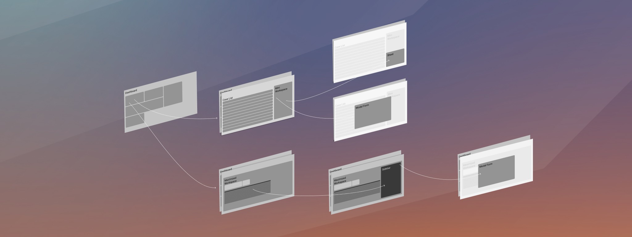
Solution
We designed a layer-based system that would help users focus on their tasks while also providing a clear visual hierarchy, guiding them through the app. We organized the app into three main layers: a record list layer, feature layer, and layer for working in forms. The layers all stacked above a dashboard screen that surfaced actionable data about records.
While developing the list view layer we made enhancements to workflows. Previously users had to use a sidebar filter and combine filter operators to locate key classes of records. We designed a filter bar with tabs that immediately displayed the most common kinds of records our users were looking for. This reduced the number of steps needed to get to key data by up to 75%.
Opening a record from the primary layer stacked the record above the list in the secondary layer. Before the redesign users had to jump back through a succession of menus to get to the list view they were working from. With the layering system users simply closed the secondary layer to return to their work list on the primary layer.
Finally, the tertiary layer was reserved for our most complex tasks. Functionally modald, the third layer displayed forms, batch actions, and other intense and focused interactions. These actions were all launched from UI elements on the secondary layer creating a strong tie between the record and modal layer. This replaced a system where users would lose their place by either having the feature launch in a new window or completely replace their current page which was prone to causing memory loss to the doorway effect.
Design Process
My team and I conducted interviews with customers and internal support users to learn the most common workflows and how users navigated through the application. We mapped system pages and workflows in a Figjam file and brainstormed on solutions.
The mapping exercise was really valuable and exposed complexities that weren't in our initial problem statement. These prompted iterations and adjustments as we worked through ideas. It was also a helpful check as we tested various ideas and weeded out the ones that failed to address the core issues or created new problems.
After developing a proposed solution we would test it against real workflows and screens in whiteboard sessions to get us out of Figma and really challenging each other's ideas and the concept. This further refined the concepts until we arrived at what we felt was a winner. At that point it was time to invest in more complex prototypes and test it with users.
User Testing
I wrote a user testing script and our team designed a series of wireframe prototypes in Figma to test the concept with users. Our testing showed users successfully navigated all workflow tasks as expected but that there was room for improvement. We incorporated suggestions and new ideas developed during our observations in the user testing. When deciding on minor issues of preference that surfaced from our test group we gathered feedback from support staff, relationship managers, and our product owners to come to conclusions on changes.
One of our challenges was creating the right sense of depth without overpowering the UI. Since we were working with a light theme to start with, we explored drop shadow libraries online. It took several attempts to get it right but our final designs used a mix of shadows to get the depth right for our margins and surface colors. These drop shadows were also applied to certain surfaces inside our layers, but didn't all work as well as they appeared in mockups in the coded applications so we are still exploring iterations to the mix.
Updates and Iterations
After going to production we kept gathering feedback and learned a small set of users could have difficulty viewing an adequate amount of screen content on some pages when at smaller laptop resolutions. We added a vertical breakpoint to the application and applied a series of small spacing adjustments that combined to significantly improve screen utilization in the identified scenario.
The enhancement was designed and quickly and deployed to production within a few sprints of our first release. We still feel there is room for improvement, but we felt it was better to iterate and release than to wait on more design time when new projects were coming at us.
Results
The layering system took rounds of design iteration to develop, but proved to be a success. Users were able to easily navigate the app and stay focused on their tasks without generating abandoned browser tabs. The visual hierarchy provided by the layering system helped users better understand where they were in the application and how to get to where they needed to go.
In addition to improving navigation, the layering system also reduced distractions by limiting the number of features displayed on the main screen. This allowed users to focus on their tasks without being overwhelmed by too many options.
Previous
Password Change